Production diary
After submitting the drafts for both my music video and website it had been concluded that the video was not fast paced enough to fit the brief of a fun loving audience, in order to fix this there is exclusively more lip syncing from my artist which allows for previous footage to be cropped down to allow for a faster flowing video. The shots in which lasted around 6 seconds (excluding lip syncing) have been cropped down due to them slowing down the overall pace of the video, this includes the car reversing off the drive heading to the field, as this shot in particular felt it slowed down the video, so has been cropped to a shorter 3 seconds. As well as this some scenes which when looking at the whole video appeared to not really fit in have been removed and this allows for a video that feels more like a stereotypical pop video. The establishing shot in which had a focus issue when panning down has been resolved by cropping it down the the shot start where it was blurry to allow for it to appear as if it started blurry from the title and focuses when the video begins (allowing for an effect which looks as if it is an intentional fade of focus from the camera). As well as these changes the end of the video features a message from the charity to allow for intertextuality and continuity from the website and video, this message was previously exactly the same layout and message from the website, which meant it looked as if it was just a screen shot, to avoid this issue there are several slides of text using a different front but same layout, allowing for that same intertextuality but avoids the issue of repeating my self in both the video and website
Draft video: https://youtu.be/EHdkKYHJ__o
Final video: https://youtu.be/ejQS1jSA_n4
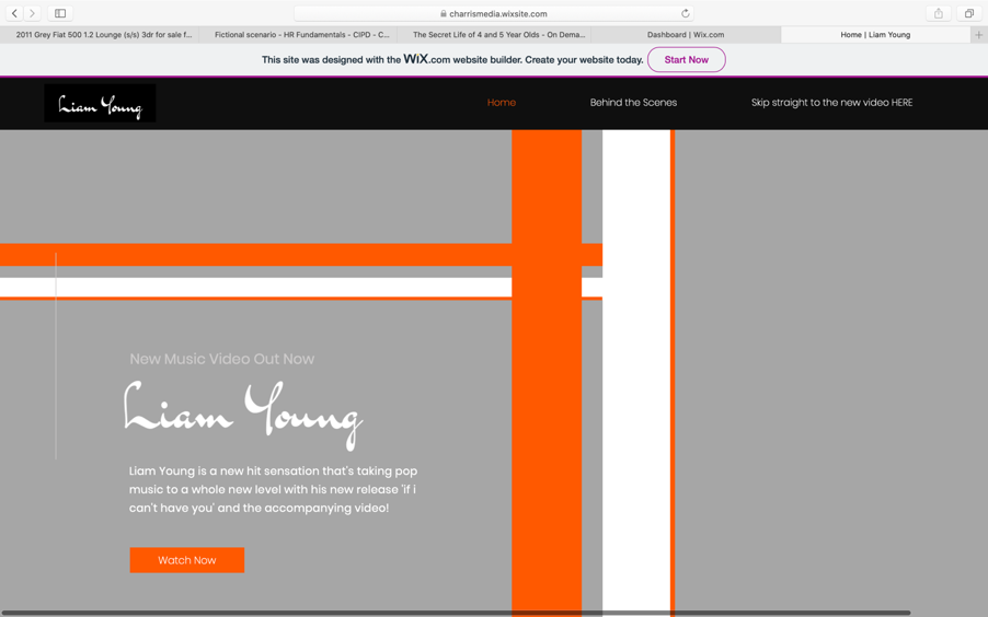
The website has been updated to allow for a more professional look. The draft website had lots of negative space which made the website look as if it was lacking in content, to fill this i did a new photo shoot with my artist and then removed the background from one of the photos which allowed the website to both introduce who the artist is when opening the website and then fill the negative space. The website also included the video on the homepage however used the YouTube thumbnail which meant the colour scheme of the website had been ruined, therefore within this new final website i have created thumbnails for both the main video and behind the scenes which means the website now flows better but also appears to be more co-ordinated, as well as a ‘share your story’ segment to go along side the message from Liam Young Which means the website feels more inclusive


Comments
Post a Comment